For a graduate course in curriculum, we have been asked to experiment with "mind mapping" software.
As my previous post reflects, I've never been comfortable with such maps personally, though I realize many people find the exercises useful. I'm clearly in a minority. It is important that teachers understand any potential tool, whether or not they are comfortable, because students are not homogeneous in learning style. I love outlining... most people do not. I also like flowcharts, graphs, and charts. Order, lots of order, works to my advantage, even when my artistic output isn't "organized" in familiar ways.
Background
As an example of how to integrate new technologies for composition across the curriculum, I am proposing a series of units relating to radio. As radio has shifted to the Internet and podcasting, radio theatre has remained a part of the tradition, from rebroadcasts of classic "Old Time Radio" programs to original plays.
Mapping
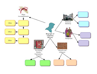
I thought a good start for appreciating how "mapping" might apply was to study an example template in Inspiration 8. The template is meant to help students compose a biography of Marconi, inventor of the terrestrial AM radio.

Notice that the yellow, green, and peach colored boxes are aligned. Then notice the blue and periwinkle boxes. I can't get past the misaligned boxes. I can only imagine my elementary and junior high teachers watching me spend an entire class period trying to get a balanced design. I also want to know what some of the icons mean — they don't seem to relate to the topics. I had to think about the "brick wall" idiom, which initially escaped me. Being baffled by the map would only delay my work on the actual project: the biography.
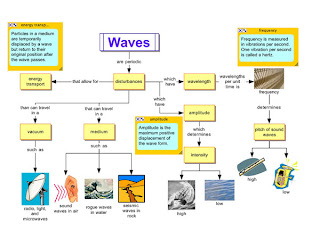
I also decided to view an Inspiration map on radio waves:

At the gut-level, my reaction is "Eeek!" The mix of icons, colors, and the overall "busyness" of the two templates makes me cringe. I was tempted to spend hours "fixing" the colors and images to make them more pleasing to me. It isn't worth writing a list of complaints; the template would merely serve as a contrast to any I would personally design.
Would I Ever Map?
I'm trying to determine where my own graphical methods might approach the more "unstructured" nature of the maps I have seen. As I have written, I like flowcharts. I am also a fan of graphical entity relationship diagrams and database modeling to remind people how data tables are relational. Family tree diagrams are an example of relationships, as are taxonomic charts. Dichotomous relationships are an important tool in parsing, organizing, classifying, et cetera.
If any diagram can be considered a "map" then I map with some regularity. The Apple programming tools use a graphical data designer for CoreData, for example. Microsoft Access, most SQL tools, and serious programming tools are visually based today. Why? Because it is much easier to design interfaces when you are manipulating exactly what software users will see.
But, I never use graphical charting tools to create stories. Character sketches are done using tables, so I do not forget to think about a particular trait. I use tables to check plot structures, as well. Tables and timelines — linear tools — help me, even when a story might not be told in a linear manner.
An Uninspired Inspiration
A May 2006 review of Inspiration 8 appeared in MacWorld. I have to say that they were a lot kinder than I would be regarding the user interface:
Interface oddities
Although Inspiration 8’s interface is as straightforward as ever, it still suffers from a number of annoyances. For example, Inspiration’s Main and Formatting toolbars are fixed rather than floating, and the Formatting toolbar is relegated to the bottom of the window.
The application’s menus aren’t as logical as they could be, either. You import graphics using the Edit menu, yet you import videos and sounds using the Tools menu. Plus, some of the commands aren’t logically placed. For instance, all of the commands under the Utility menu would fit better elsewhere, while Preferences appear both in Utilities and the application’s own menu.
This might be the "least Mac-like" application I have used on my Mac outside the Unix applications I run from time-to-time. I kept getting the sense I was running a Windows application via Parallels. Inspiration is not a "Cocoa" application: it is a Carbon application, meaning it is based on an older programming framework. The use of Carbon means Inspiration works on OS 8/9 and it probably makes it easier to share code between PC and Mac versions, but the interface is jarring in some ways. Things are where Windows users expect them, which is why Preferences is under Utilities.
Even on Windows, formatting tools in applications belong at the top of the screen or I should have the option of moving them! At least let me "float" the tools, which is possible with the library of symbols in Inspiration.
MacWorld gave Inspiration 4.5 "Mice" (stars) and an overall good review for its support of curriculum standards. In other words, Inspiration is pre-packaged with a lot of templates teachers can use with minimal extra effort. I think that's generally a good thing: technology should not slow down teachers who are busy enough without mastering new software. On the other hand, a more "Mac-like" interface would make it easier to learn the software.
Would I Use Inspiration?
Yes, and this is a very important point to make: I might have students who would benefit from mind maps and other graphical organizers. I should never assume that my mental process is the dominant learning style; I know it isn't. Learning how to use Inspiration should not be difficult, though I will probably continue to long for features that aren't actually needed to their market.
I expect students would adapt to Inspiration more quickly than I am. I could see combining some ideas from Inspiration with OmniGraffle, which also has a (poor) outlining mode. I definitely prefer Omni Group's tools, but Inspiration's inclusion of so many templates would save a lot of time and effort when planning potential course lessons.
There's no doubt I will learn and use Inspiration in order to be well-informed and current with educational technology. I hope that enables me to help students who would benefit from the use of Inspiration. I definitely know some students who would gain a lot if they had to organize their ideas before typing a single sentence.
Comments
Post a Comment
Comments violating the policies of this blog will not be approved for posting. Language and content should be appropriate for all readers and maintain a polite tone. Thank you.